Life tables, survivorship, & age-sex structure
Life tables, survivorship, & age-sex structure
- To predict if a population will grow or shrink, ecologists need to know birth and death rates for organisms at different ages as well as the current age and sex makeup of the population.
- Life tables summarize birth and death rates for organisms at different stages of their lives.
- Survivorship curves are graphs that show what fraction of a population survives from one age to the next.
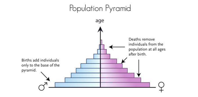
- An age-sex pyramid is a "snapshot" of a population in time showing how its members are distributed among age and sex categories.
A life table records matters of life and death for a population—literally! It summarizes the likelihood that organisms in a population will live, die, and/or reproduce at different stages of their lives.
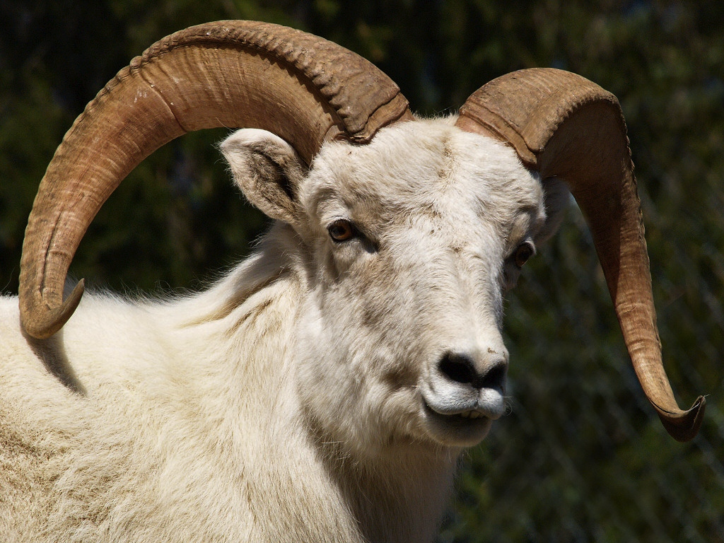
Let's start simply by taking a look at a basic life table that just shows survival—rather than survival and reproduction. Specifically, we'll focus on the animal below: the Dall mountain sheep, a wild sheep of northwestern North America.
For full disclosure, this data was collected in a pretty weird way. An ecologist named Olaus Murie hiked around Mount McKinley National Park in Alaska for several years in the 1930s and 1940s. Every time he came across the skull of a dead Dall mountain sheep, he used the size of its horns to estimate how old it must have been when it died. From the ages of the 608 skulls he discovered, he estimated survival and death rates for the sheep across their lifespans.
Below, we have a table based on Murie's skull collection data. To make it easier to read, the table is standardized to a population of 1000 sheep. As we walk through the table, we can picture what will happen, on average, to those 1000 sheep—specifically, how many will survive or die in each age bracket.
Let's walk together through the first row of the table. Here, we see that 1000 sheep are born, reach an age of zero. Of those sheep, 54 will die before they reach 0.5 years of age. That makes for a death, or mortality, rate of 54/1000, or 0.054, which is recorded in the far-right column.
| Age interval in years | Number surviving at beginning of age interval out of 1000 born | Number dying in age interval out of 1000 born | Age-specific mortality rate—fraction of individuals alive at beginning of interval that die during the interval |
|---|---|---|---|
| 0–0.5 | 1000 | 54 | 0.054 |
| 0.5–1 | 946 | 145 | 0.1533 |
| 1–2 | 801 | 12 | 0.015 |
| 2–3 | 789 | 13 | 0.0165 |
| 3–4 | 776 | 12 | 0.0155 |
| 4–5 | 764 | 30 | 0.0393 |
| 5–6 | 734 | 46 | 0.0627 |
| 6–7 | 688 | 48 | 0.0698 |
| 7–8 | 640 | 69 | 0.1078 |
| 8–9 | 571 | 132 | 0.2312 |
| 9–10 | 439 | 187 | 0.426 |
| 10–11 | 252 | 156 | 0.619 |
| 11–12 | 96 | 90 | 0.9375 |
| 12–13 | 6 | 3 | 0.5 |
| 13–14 | 3 | 3 | 1 |
This is a relatively bare-bones life table; it only shows survival rates, not reproduction rates. Many life tables show both survival and reproduction. If we added reproduction to this table, we would have another column listing the average number of lambs produced per sheep in each age interval.
Survivorship curves
A survivorship curve shows what fraction of a starting group is still alive at each successive age. For example, the survivorship curve for Dall mountain sheep is shown below:

The graph makes it nice and clear that there's a small dip in sheep survival early on, but most of the sheep die relatively late in life.
Different species have differently shaped survivorship curves. In general, we can divide survivorship curves into three types based on their shapes:

- Type I. Humans and most primates have a Type I survivorship curve. In a Type I curve, organisms tend not to die when they are young or middle-aged but, instead, die when they become elderly. Species with Type I curves usually have small numbers of offspring and provide lots of parental care to make sure those offspring survive.
- Type II. Many bird species have a Type II survivorship curve. In a Type II curve, organisms die more or less equally at each age interval. Organisms with this type of survivorship curve may also have relatively few offspring and provide significant parental care.
- Type III. Trees, marine invertebrates, and most fish have a Type III survivorship curve. In a Type III curve, very few organisms survive their younger years. However, the lucky ones that make it through youth are likely to have pretty long lives after that. Species with this type of curve usually have lots of offspring at once—such as a tree releasing thousands of seeds—but don't provide much care for the offspring.
Age-sex structure
For instance, suppose we have two populations of bears: one made up mostly of young, reproductive-aged female bears and one made up mostly of male bears past their reproductive years. Even if these populations are the same size and share a life table—have the same reproduction and survival rates at a given age—they are likely to follow different paths.
- The first population is likely to grow because it has many bears that are in prime position to produce baby bears, cubs.
- The second population is likely to shrink because it has many bears that are close to death and can no longer reproduce.
So, who's currently in a population makes a big difference when we are thinking about future population growth! Information about the age-sex structure of a population is often shown as a population pyramid. The x-axis shows the percent of the population in each category, with males to the left and females to the right. The y-axis shows age groups from birth to old age.

It's common to see population pyramids used to represent human populations. In fact, there are specific shapes of pyramids that tend to be associated with growing, stable, and shrinking human populations, as shown below.

- Countries with rapid population growth have a sharp pyramid shape in their age structure diagrams. That is, they have a large fraction of younger people, many of whom are of reproductive age or will be soon. This pattern often shows up for countries that are economically less developed, where lifespan is limited by access to medical care and other resources.
- Areas with slow growth, including more economically developed countries like the United States, still have age-sex structures with a pyramid shape. However, the pyramid is not as sharp, meaning that there are fewer young and reproductive-aged people and more old people relative to rapidly growing countries.
- Other developed countries, such as Italy, have zero population growth. The age structure of these populations has a dome or silo shape, with an even greater percentage of middle-aged and old people than in the slow-growing example.
- Finally, some developed countries actually have shrinking populations. This is the case for Japan
The population pyramid for these countries typically pinches inward towards its base, reflecting that young people are a small fraction of the population.
The basic principles of these human examples hold true for many populations in nature. Large fractions of young and reproductive individuals mean a population is likely to grow. Large fractions of individuals past reproductive age mean a population is likely to shrink.


Komentar
Posting Komentar